
I have started to delve into my Book Launch Strategy Checklist from Kindlepreneur. It is a one-page summary that I settled on, to keep me on track. IngramSpark has a good article on their site, Book Launch Checklist: A Cheat Sheet for Your New Release, which I found useful. It is thorough, about eight pages long, but not really a checklist with boxes to check off. If you google (yes, google has become a verb) the term “Book Launch Checklist,” you will get pages of offerings from which to choose.
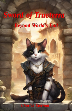
One of the items on my checklist is the front cover reveal. Well, here is my proposed cover for this next book (a sequel to A Vacant Throne). I played around with Binge AI’s image generator and also Canva’s generator. I glanced at Leonardo’s AI, which looks pretty good too. There are dozens of image generating options to play with for free; doesn’t cost you anything to get your paws wet.
How does it work? Type in a description, say, “This is a fantasy book cover about a medieval world of cats. The main character is a female calico cat. She wears a leather vest and holds a sword. The background is a stone arch.”
Most of the generators will give you four images to look at. You can repeat the instructions with a click and get four more images, or refine your instructions and try again. You can do this again and again and again and . . .
Warning: the more you do this, the wackier it gets. It will put a cat’s head on an otherwise human body, or a human’s face on a cat’s body, or it might forget that the cat is supposed to be a calico or that there is supposed to be a sword (as in the case above. I liked it anyway.)
Cheapskate that I am, I used the free versions, but they gave me an introduction to this whole realm. I am sure the paid versions have much more facility.
I will embarrass myself and give you the history of A Vacant Throne’s cover design. First, I will confess that I am an incurable DIYer and make no pretense of recovering. Below is my first cover.
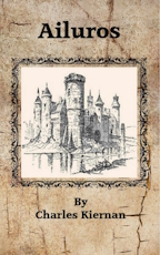
You should note the title. A really terrible title. Why? It says nothing about the book. I thought myself clever. The name is derived from the Greek word for “cat.” But, my story has nothing to do with the Greeks! The word conveys no meaning to the reader. Only the castle starts to give a hint of the story’s setting. The cover also lacks a sub-title.
I still like the look of this cover, but it does not meet genré expectations. Let me underline this. It Does not meet genré expectations. Take a look at a romance cover, and then look at self-help cover. The difference will be clear. If a genré reader does not see what they expect to see, they will look elsewhere.
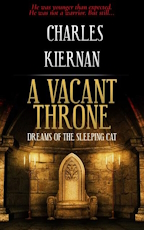
Next, I stowed my DIY inclinations in a dark corner and searched for a professionally designed cover. This one I found on BookZone. On sites like this (again, there are many) there can be found unused book covers often for under $150. Cover designers typically make multiple versions for a client from which to choose. The rejects end up on sites like BookZone at bargain prices. BookZone includes the software onsite to put your title and other descriptions on the cover and back cover, make small alterations, and create the properly sized spine. Quite a nice service.
I loved the cover at first. “Throne” was in the new title, and a throne was on the cover. That remained the cover for some time. Gradually, I recognized the cover was rather dark and brooding. More dark and brooding than my story. Perhaps more importantly, no “live” character graced the image. The cover was cold.

Entered my son with his access to Midjourney one holiday gathering and produced this image of my main character. My DIY leapt from its corner, taking me over once more. I slapped a title at the top, my name at the bottom, and replaced the cover. Now, a cat holding a sword, dressed for battle, jumped out at the viewer from a book in which cats are the main characters.
Not for long. That it does not meet genré expectations reared its ugly head. The black bar at the top and bottom would not do.
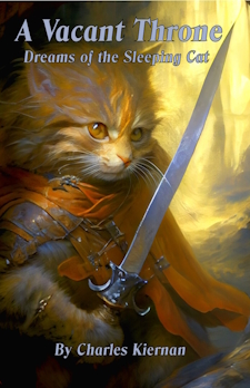
Climbing up the learning curve in Publisher, I produced and settled on this version. Note that the image of the cat is much larger, which, when seen on Amazon as a thumbnail, is more striking. I also have a thin outline around the fonts to make them stand out and not blend into the colors behind them. Your cover must look good as a thumbnail. That is what your prospective reader will be clicking on to get to your product page. Worry about the small stuff.
Next month, I plan to agonize over ARC’s (Advance Reader Copies).
